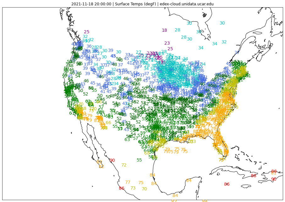
Colored Surface Temperature Plot
Notebook Python-AWIPS Tutorial Notebook
Objectives
Use python-awips to connect to an edex server
Define and filter data request for METAR surface obs
Define a color threshold and use it to plot a useful map
Create a product similar to existing products in GEMPAK and CAVE
Table of Contents
1 Imports
The imports below are used throughout the notebook. Note the first import is coming directly from python-awips and allows us to connect to an EDEX server. The subsequent imports are for data manipulation and visualization.
from awips.dataaccess import DataAccessLayer
from dynamicserialize.dstypes.com.raytheon.uf.common.time import TimeRange
from datetime import datetime, timedelta, UTC
import numpy as np
import cartopy.crs as ccrs
import warnings
import matplotlib.pyplot as plt
from shapely.geometry import Polygon
from metpy.plots import StationPlot
2 Initial Setup
2.1 Geographic Filter
By defining a bounding box for the Continental US (CONUS), we’re able to optimize the data request sent to the EDEX server.
# CONUS bounding box and envelope geometry
bbox=[-130, -70, 15, 55]
envelope = Polygon([(bbox[0],bbox[2]),(bbox[0],bbox[3]),
                    (bbox[1], bbox[3]),(bbox[1],bbox[2]),
                    (bbox[0],bbox[2])])
2.2 EDEX Connection
First we establish a connection to Unidata’s public EDEX server. With that connection made, we can create a new data request object and set the data type to obs, and use the geographic envelope we just created.
# New obs request
edexServer = "edex-cloud.unidata.ucar.edu"
DataAccessLayer.changeEDEXHost(edexServer)
request = DataAccessLayer.newDataRequest("obs", envelope=envelope)
params = ["temperature", "longitude", "latitude", "stationName"]
request.setParameters(*(params))
3 Filter by Time
We then want to limit our results based on time, so we create a time range for the last 15 minutes, and then send the request to the EDEX server to get our results, which are kept in the obs variable.
# Get records from the last 15 minutes
lastHourDateTime = datetime.now(UTC) - timedelta(minutes = 15)
start = lastHourDateTime.strftime('%Y-%m-%d %H:%M:%S')
end = datetime.now(UTC).strftime('%Y-%m-%d %H:%M:%S')

beginRange = datetime.strptime( start , "%Y-%m-%d %H:%M:%S")
endRange = datetime.strptime( end , "%Y-%m-%d %H:%M:%S")
timerange = TimeRange(beginRange, endRange)
# Get response
response = DataAccessLayer.getGeometryData(request,timerange)
obs = DataAccessLayer.getMetarObs(response)

lats = obs['latitude']
lons = obs['longitude']

print("Found " + str(len(response)) + " total records")
print("Using " + str(len(obs['temperature'])) + " temperature records")
Found 1704 total records
Using 1660 temperature records
4 Access and Convert Temp Data
We access the temperature data from the obs variable which is stored in degrees Celsius (°C). To make it more relatable, we then convert the data to degrees Fahreheit (°F)
# # Suppress nan masking warnings
warnings.filterwarnings("ignore",category =RuntimeWarning)

# get all temperature values and convert them from °C to °F
tair = np.array(obs['temperature'], dtype=float)
tair[tair == -9999.0] = 'nan'
tair = (tair*1.8)+32
5 Define Temperature Thresholds
In order to distinguish the temperatures, we’ll create a color map to separate the values into different colors. This mapping will be used when plotting the temperature values on the map of the United States.
Tip: Try playing around with the color ranges and see how that affects the final plot.
thresholds = {
    '15': 'purple',
    '25': 'c',
    '35': 'royalblue',
    '45': 'darkgreen',
    '55': 'green',
    '65': 'y',
    '75': 'orange',
    '85': 'red'
}
6 Plot the Data!
Here we create a plot and cycle through all the values from our color mapping. For each segement of our color mapping, mask the temperature values to only include the relevent temperatures and draw those on the plot. Do this for every segment of the color mapping to produce the final, colored figure.
fig, ax = plt.subplots(figsize=(16,12),subplot_kw=dict(projection=ccrs.LambertConformal()))
ax.set_extent(bbox)
ax.coastlines(resolution='50m')
ax.set_title(str(response[-1].getDataTime()) + " | Surface Temps (degF) | " + edexServer)

# get the temperature limit (x) and color (value)
for x, value in thresholds.items():
    # create a new temperature value array
    subtair = tair.copy()

    # pair down the temperature values to a subset
    if x==max(thresholds):
        subtair[(subtair < int(x))] = 'nan'
    elif x==min(thresholds):
        subtair[(subtair >= int(x)+10)] = 'nan'
    else:
        subtair[(subtair < int(x))] = 'nan'
        subtair[(subtair >= int(x)+10)] = 'nan'

    # add these stations and their color to the stationplots
    stationplot = StationPlot(ax, lons, lats, transform=ccrs.PlateCarree(), fontsize=14)
    stationplot.plot_parameter('C', subtair, color=value)
7 See Also
7.1 Additional Documentation
python-awips
matplotlib