Note
Go to the end to download the full example code.
NDBC Buoy Meteorological Data Request
The NDBC keeps a 45-day recent rolling file for each buoy. This examples shows how to access the basic meteorological data from a buoy and make a simple plot.
import matplotlib.pyplot as plt

from siphon.simplewebservice.ndbc import NDBC
Get a pandas data frame of all of the observations, meteorological data is the default observation set to query.
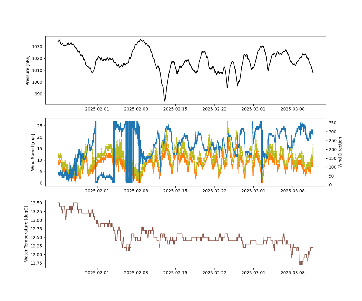
df = NDBC.realtime_observations('46001')
df.head()
Let’s make a simple time series plot to checkout what the data look like.
fig, (ax1, ax2, ax3) = plt.subplots(3, 1, figsize=(12, 10))
ax2b = ax2.twinx()

# Pressure
ax1.plot(df['time'], df['pressure'], color='black')
ax1.set_ylabel('Pressure [hPa]')

# Wind speed, gust, direction
ax2.plot(df['time'], df['wind_speed'], color='tab:orange')
ax2.plot(df['time'], df['wind_gust'], color='tab:olive', linestyle='--')
ax2b.plot(df['time'], df['wind_direction'], color='tab:blue', linestyle='-')
ax2.set_ylabel('Wind Speed [m/s]')
ax2b.set_ylabel('Wind Direction')

# Water temperature
ax3.plot(df['time'], df['water_temperature'], color='tab:brown')
ax3.set_ylabel('Water Temperature [degC]')

plt.show()
Total running time of the script: (0 minutes 0.480 seconds)