Upper Air Sounding Tutorial
Upper air analysis is a staple of many synoptic and mesoscale analysis problems. In this tutorial we will gather weather balloon data, plot it, perform a series of thermodynamic calculations, and summarize the results. To learn more about the Skew-T diagram and its use in weather analysis and forecasting, checkout this air weather service guide.
from datetime import datetime

import matplotlib.pyplot as plt
from mpl_toolkits.axes_grid1.inset_locator import inset_axes
import numpy as np

import metpy.calc as mpcalc
from metpy.io import get_upper_air_data
from metpy.plots import Hodograph, SkewT
Getting Data
We will download data from the University of Wyoming sounding data page , which has an extensive archive of data available, as well as current data.
In this case, we will download the sounding data from the Veterans Day
tornado outbreak in 2002 by passing a datetime object and station name to the
get_upper_air_data function.
dataset = get_upper_air_data(datetime(2002, 11, 11, 0), 'BNA')
# We can view the fields available in the dataset. We will create some simple
# variables to make the rest of the code more concise.

print(dataset.variables.keys())

p = dataset.variables['pressure'][:]
T = dataset.variables['temperature'][:]
Td = dataset.variables['dewpoint'][:]
u = dataset.variables['u_wind'][:]
v = dataset.variables['v_wind'][:]
Out:
odict_keys(['pressure', 'temperature', 'dewpoint', 'u_wind', 'v_wind', 'speed', 'direction'])
Thermodynamic Calculations
Often times we will want to calculate some thermodynamic parameters of a sounding. The MetPy calc module has many such calculations already implemented!
- Lifting Condensation Level (LCL) - The level at which an air parcel’s relative humidity becomes 100% when lifted along a dry adiabatic path.
- Parcel Path - Path followed by a hypothetical parcel of air, beginning at the surface temperature/pressure and rising dry adiabatically until reaching the LCL, then rising moist adiabatially.
# Calculate the LCL
lcl_pressure, lcl_temperature = mpcalc.lcl(p[0], T[0], Td[0])

print(lcl_pressure, lcl_temperature)

# Calculate the parcel profile.
parcel_prof = mpcalc.parcel_profile(p, T[0], Td[0]).to('degC')
Out:
923.0967855539084 hectopascal 15.595464142369861 degC
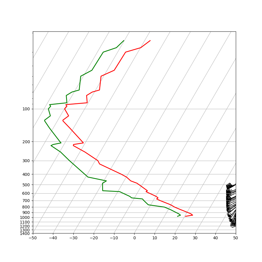
Basic Skew-T Plotting
The Skew-T (log-P) diagram is the standard way to view rawinsonde data. The y-axis is height in pressure coordinates and the x-axis is temperature. The y coordinates are plotted on a logarithmic scale and the x coordinate system is skewed. An explanation of skew-T interpretation is beyond the scope of this tutorial, but here we will plot one that can be used for analysis or publication.
The most basic skew-T can be plotted with only five lines of Python. These lines perform the following tasks:
- Create a
Figureobject and set the size of the figure. - Create a
SkewTobject - Plot the pressure and temperature (note that the pressure, the independent variable, is first even though it is plotted on the y-axis).
- Plot the pressure and dewpoint temperature.
- Plot the wind barbs at the appropriate pressure using the u and v wind components.
# Create a new figure. The dimensions here give a good aspect ratio
fig = plt.figure(figsize=(9, 9))
skew = SkewT(fig)

# Plot the data using normal plotting functions, in this case using
# log scaling in Y, as dictated by the typical meteorological plot
skew.plot(p, T, 'r', linewidth=2)
skew.plot(p, Td, 'g', linewidth=2)
skew.plot_barbs(p, u, v)

# Show the plot
plt.show()
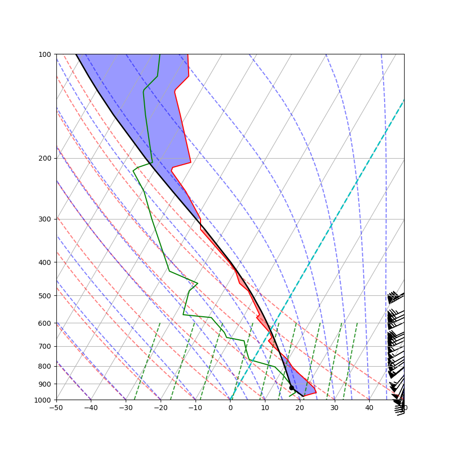
Advanced Skew-T Plotting
Fiducial lines indicating dry adiabats, moist adiabats, and mixing ratio are useful when performing further analysis on the Skew-T diagram. Often the 0C isotherm is emphasized and areas of CAPE and CIN are shaded.
# Create a new figure. The dimensions here give a good aspect ratio
fig = plt.figure(figsize=(9, 9))
skew = SkewT(fig, rotation=30)

# Plot the data using normal plotting functions, in this case using
# log scaling in Y, as dictated by the typical meteorological plot
skew.plot(p, T, 'r')
skew.plot(p, Td, 'g')
skew.plot_barbs(p, u, v)
skew.ax.set_ylim(1000, 100)
skew.ax.set_xlim(-40, 60)

# Plot LCL temperature as black dot
skew.plot(lcl_pressure, lcl_temperature, 'ko', markerfacecolor='black')

# Plot the parcel profile as a black line
skew.plot(p, parcel_prof, 'k', linewidth=2)

# Color regions of CAPE and CIN (the area between the actual temperature and
# the parcel path).
skew.ax.fill_betweenx(p, T, parcel_prof, where=T >= parcel_prof, facecolor='blue', alpha=0.4)
skew.ax.fill_betweenx(p, T, parcel_prof, where=T < parcel_prof, facecolor='red', alpha=0.4)

# Plot a zero degree isotherm
l = skew.ax.axvline(0, color='c', linestyle='--', linewidth=2)

# Add the relevant special lines
skew.plot_dry_adiabats()
skew.plot_moist_adiabats()
skew.plot_mixing_lines()

# Show the plot
plt.show()
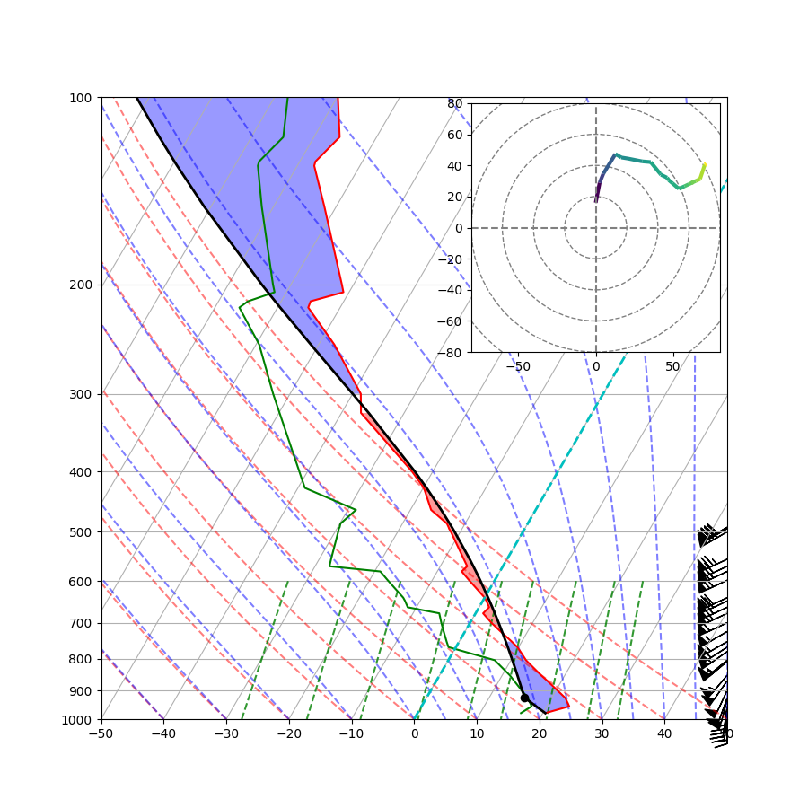
Adding a Hodograph
A hodograph is a polar representation of the wind profile measured by the rawinsonde. Winds at different levels are plotted as vectors with their tails at the origin, the angle from the vertical axes representing the direction, and the length representing the speed. The line plotted on the hodograph is a line connecting the tips of these vectors, which are not drawn.
# Create a new figure. The dimensions here give a good aspect ratio
fig = plt.figure(figsize=(9, 9))
skew = SkewT(fig, rotation=30)

# Plot the data using normal plotting functions, in this case using
# log scaling in Y, as dictated by the typical meteorological plot
skew.plot(p, T, 'r')
skew.plot(p, Td, 'g')
skew.plot_barbs(p, u, v)
skew.ax.set_ylim(1000, 100)
skew.ax.set_xlim(-40, 60)

# Plot LCL as black dot
skew.plot(lcl_pressure, lcl_temperature, 'ko', markerfacecolor='black')

# Plot the parcel profile as a black line
skew.plot(p, parcel_prof, 'k', linewidth=2)

# Color regions of CAPE and CIN (the area between the actual temperature and
# the parcel path).
skew.ax.fill_betweenx(p, T, parcel_prof, where=T >= parcel_prof, facecolor='blue', alpha=0.4)
skew.ax.fill_betweenx(p, T, parcel_prof, where=T < parcel_prof, facecolor='red', alpha=0.4)

# Plot a zero degree isotherm
l = skew.ax.axvline(0, color='c', linestyle='--', linewidth=2)

# Add the relevant special lines
skew.plot_dry_adiabats()
skew.plot_moist_adiabats()
skew.plot_mixing_lines()

# Create a hodograph
# Create an inset axes object that is 40% width and height of the
# figure and put it in the upper right hand corner.
ax_hod = inset_axes(skew.ax, '40%', '40%', loc=1)
h = Hodograph(ax_hod, component_range=80.)
h.add_grid(increment=20)
h.plot_colormapped(u, v, np.hypot(u, v))  # Plot a line colored by wind speed

# Show the plot
plt.show()
Total running time of the script: ( 0 minutes 1.351 seconds)