Station Plot
Make a station plot, complete with sky cover and weather symbols.
The station plot itself is pretty straightforward, but there is a bit of code to perform the data-wrangling (hopefully that situation will improve in the future). Certainly, if you have existing point data in a format you can work with trivially, the station plot will be simple.
import cartopy.crs as ccrs
import cartopy.feature as feat
import matplotlib.pyplot as plt
import numpy as np

from metpy.calc import get_wind_components
from metpy.cbook import get_test_data
from metpy.plots import StationPlot
from metpy.plots.wx_symbols import current_weather, sky_cover
from metpy.units import units
The setup
First read in the data. We use numpy.loadtxt to read in the data and use a structured numpy.dtype to allow different types for the various columns. This allows us to handle the columns with string data.
f = get_test_data('station_data.txt')

all_data = np.loadtxt(f, skiprows=1, delimiter=',',
                      usecols=(1, 2, 3, 4, 5, 6, 7, 17, 18, 19),
                      dtype=np.dtype([('stid', '3S'), ('lat', 'f'), ('lon', 'f'),
                                      ('slp', 'f'), ('air_temperature', 'f'),
                                      ('cloud_fraction', 'f'), ('dewpoint', 'f'),
                                      ('weather', '16S'),
                                      ('wind_dir', 'f'), ('wind_speed', 'f')]))
This sample data has way too many stations to plot all of them. Instead, we just select a few from around the U.S. and pull those out of the data file.
# Get the full list of stations in the data
all_stids = [s.decode('ascii') for s in all_data['stid']]

# Pull out these specific stations
whitelist = ['OKC', 'ICT', 'GLD', 'MEM', 'BOS', 'MIA', 'MOB', 'ABQ', 'PHX', 'TTF',
             'ORD', 'BIL', 'BIS', 'CPR', 'LAX', 'ATL', 'MSP', 'SLC', 'DFW', 'NYC', 'PHL',
             'PIT', 'IND', 'OLY', 'SYR', 'LEX', 'CHS', 'TLH', 'HOU', 'GJT', 'LBB', 'LSV',
             'GRB', 'CLT', 'LNK', 'DSM', 'BOI', 'FSD', 'RAP', 'RIC', 'JAN', 'HSV', 'CRW',
             'SAT', 'BUY', '0CO', 'ZPC', 'VIH']

# Loop over all the whitelisted sites, grab the first data, and concatenate them
data = np.concatenate([all_data[all_stids.index(site)].reshape(1,) for site in whitelist])
Now that we have the data we want, we need to perform some conversions:
- Get a list of strings for the station IDs
- Get wind components from speed and direction
- Convert cloud fraction values to integer codes [0 - 8]
- Map METAR weather codes to WMO codes for weather symbols
# Get all of the station IDs as a list of strings
stid = [s.decode('ascii') for s in data['stid']]

# Get the wind components, converting from m/s to knots as will be appropriate
# for the station plot
u, v = get_wind_components((data['wind_speed'] * units('m/s')).to('knots'),
                           data['wind_dir'] * units.degree)

# Convert the fraction value into a code of 0-8, which can be used to pull out
# the appropriate symbol
cloud_frac = (8 * data['cloud_fraction']).astype(int)

# Map weather strings to WMO codes, which we can use to convert to symbols
# Only use the first symbol if there are multiple
wx_text = [s.decode('ascii') for s in data['weather']]
wx_codes = {'': 0, 'HZ': 5, 'BR': 10, '-DZ': 51, 'DZ': 53, '+DZ': 55,
            '-RA': 61, 'RA': 63, '+RA': 65, '-SN': 71, 'SN': 73, '+SN': 75}
wx = [wx_codes[s.split()[0] if ' ' in s else s] for s in wx_text]
Now all the data wrangling is finished, just need to set up plotting and go Set up the map projection and set up a cartopy feature for state borders
proj = ccrs.LambertConformal(central_longitude=-95, central_latitude=35,
                             standard_parallels=[35])
state_boundaries = feat.NaturalEarthFeature(category='cultural',
                                            name='admin_1_states_provinces_lines',
                                            scale='110m', facecolor='none')
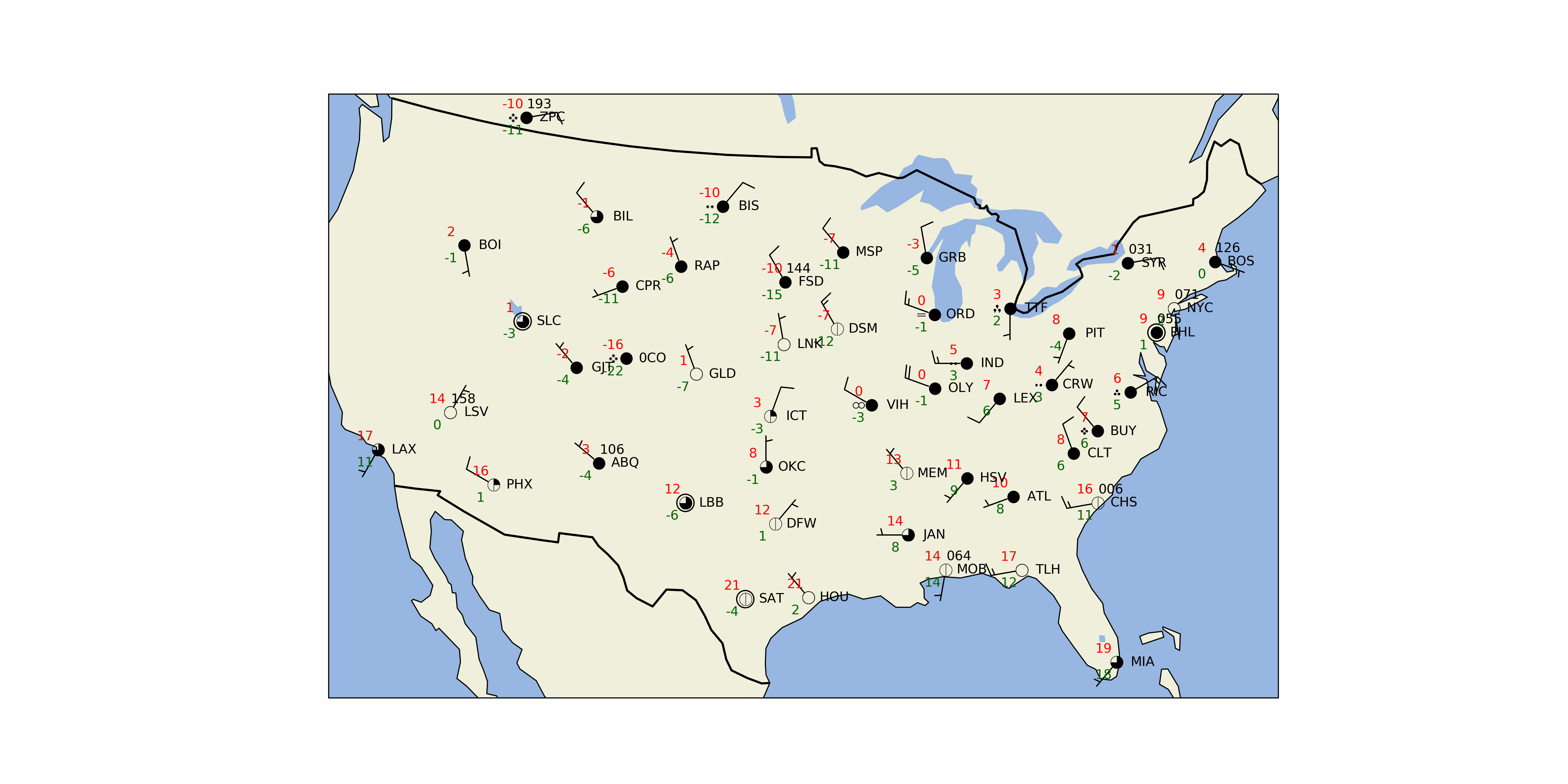
The payoff
# Change the DPI of the resulting figure. Higher DPI drastically improves the
# look of the text rendering
plt.rcParams['savefig.dpi'] = 255

# Create the figure and an axes set to the projection
fig = plt.figure(figsize=(20, 10))
ax = fig.add_subplot(1, 1, 1, projection=proj)

# Add some various map elements to the plot to make it recognizable
ax.add_feature(feat.LAND, zorder=-1)
ax.add_feature(feat.OCEAN, zorder=-1)
ax.add_feature(feat.LAKES, zorder=-1)
ax.coastlines(resolution='110m', zorder=2, color='black')
ax.add_feature(state_boundaries)
ax.add_feature(feat.BORDERS, linewidth='2', edgecolor='black')

# Set plot bounds
ax.set_extent((-118, -73, 23, 50))

#
# Here's the actual station plot
#

# Start the station plot by specifying the axes to draw on, as well as the
# lon/lat of the stations (with transform). We also the fontsize to 12 pt.
stationplot = StationPlot(ax, data['lon'], data['lat'], transform=ccrs.PlateCarree(),
                          fontsize=12)

# Plot the temperature and dew point to the upper and lower left, respectively, of
# the center point. Each one uses a different color.
stationplot.plot_parameter('NW', data['air_temperature'], color='red')
stationplot.plot_parameter('SW', data['dewpoint'], color='darkgreen')

# A more complex example uses a custom formatter to control how the sea-level pressure
# values are plotted. This uses the standard trailing 3-digits of the pressure value
# in tenths of millibars.
stationplot.plot_parameter('NE', data['slp'],
                           formatter=lambda v: format(10 * v, '.0f')[-3:])

# Plot the cloud cover symbols in the center location. This uses the codes made above and
# uses the `sky_cover` mapper to convert these values to font codes for the
# weather symbol font.
stationplot.plot_symbol('C', cloud_frac, sky_cover)

# Same this time, but plot current weather to the left of center, using the
# `current_weather` mapper to convert symbols to the right glyphs.
stationplot.plot_symbol('W', wx, current_weather)

# Add wind barbs
stationplot.plot_barb(u, v)

# Also plot the actual text of the station id. Instead of cardinal directions,
# plot further out by specifying a location of 2 increments in x and 0 in y.
stationplot.plot_text((2, 0), stid)

plt.show()
Total running time of the script: ( 0 minutes 0.085 seconds)