Colorized Grid Data
Python-AWIPS Tutorial Notebook

Objectives
Create a colorized plot for the continental US of model data (grib).
Access the model data from an EDEX server and limit the data returned by using model specific parameters.
Use both pcolormesh and contourf to create colorized plots, and compare the differences between the two.
Table of Contents
Imports
Start by importing both the python-awips specific library, as well as the libraries needed for plotting and manipulating the data
from awips.dataaccess import DataAccessLayer
import cartopy.crs as ccrs
import matplotlib.pyplot as plt
from cartopy.mpl.gridliner import LONGITUDE_FORMATTER, LATITUDE_FORMATTER
from scipy.constants import convert_temperatureDefine Data Request
If you read through the python-awips: How to Access Data training, you will know that we need to set an EDEX url to access our server, and then we create a data request. In this example we use grid as the data type to define our request. In addition to setting the data type, the location, parameters and levels are also set as RAP13, T (for temperature), and 2.0FHAG (for Fixed Height Above Ground in meters), respectively.
DataAccessLayer.changeEDEXHost("edex-cloud.unidata.ucar.edu")
request = DataAccessLayer.newDataRequest()
request.setDatatype("grid")
request.setLocationNames("RAP13")
request.setParameters("T")
request.setLevels("2.0FHAG")

# Take a look at our request
print(request)
DefaultDataRequest(datatype=grid, identifiers={}, parameters=['T'], levels=[<dynamicserialize.dstypes.com.raytheon.uf.common.dataplugin.level.Level.Level object at 0x10e7ef620>], locationNames=['RAP13'], envelope=None)
Limit Results Based on Time
Models produce many different time variants during their runs, so let’s limit the data to the most recent time and forecast run.
cycles = DataAccessLayer.getAvailableTimes(request, True)
times = DataAccessLayer.getAvailableTimes(request)
fcstRun = DataAccessLayer.getForecastRun(cycles[-1], times)

# Get the most recent grid data
response = DataAccessLayer.getGridData(request, [fcstRun[0]])

print('Number of available times:', len(times))
print('Number of available forecast runs:', len(fcstRun))
Number of available times: 555
Number of available forecast runs: 5
Function: make_map()
In order to plot more than one image, it’s easiest to define common logic in a function. Here, a new function called make_map is defined. This function uses the matplotlib.pyplot package (plt) to create a figure and axis. The coastlines (continental boundaries) are added, along with lat/lon grids.
def make_map(bbox, projection=ccrs.PlateCarree()):
    fig, ax = plt.subplots(figsize=(16, 9),
            subplot_kw=dict(projection=projection))
    ax.set_extent(bbox)
    ax.coastlines(resolution='50m')
    gl = ax.gridlines(draw_labels=True)
    gl.top_labels = gl.right_labels = False
    gl.xformatter = LONGITUDE_FORMATTER
    gl.yformatter = LATITUDE_FORMATTER
return fig, axUse the Grid Data!
Here we get our grid data object from our previous response, and then get the raw data array off that object. We also get the latitude and longitude arrays, and create a bounding box that we’ll use when creating our plots (by calling make_map defined above). Finally, we’ll convert our data from degrees Kelvin to Farenheit to make the plot more understandable.
grid = response[0]
data = grid.getRawData()
lons, lats = grid.getLatLonCoords()
bbox = [lons.min(), lons.max(), lats.min(), lats.max()]
# Convert temp from Kelvin to F
destUnit = 'F'
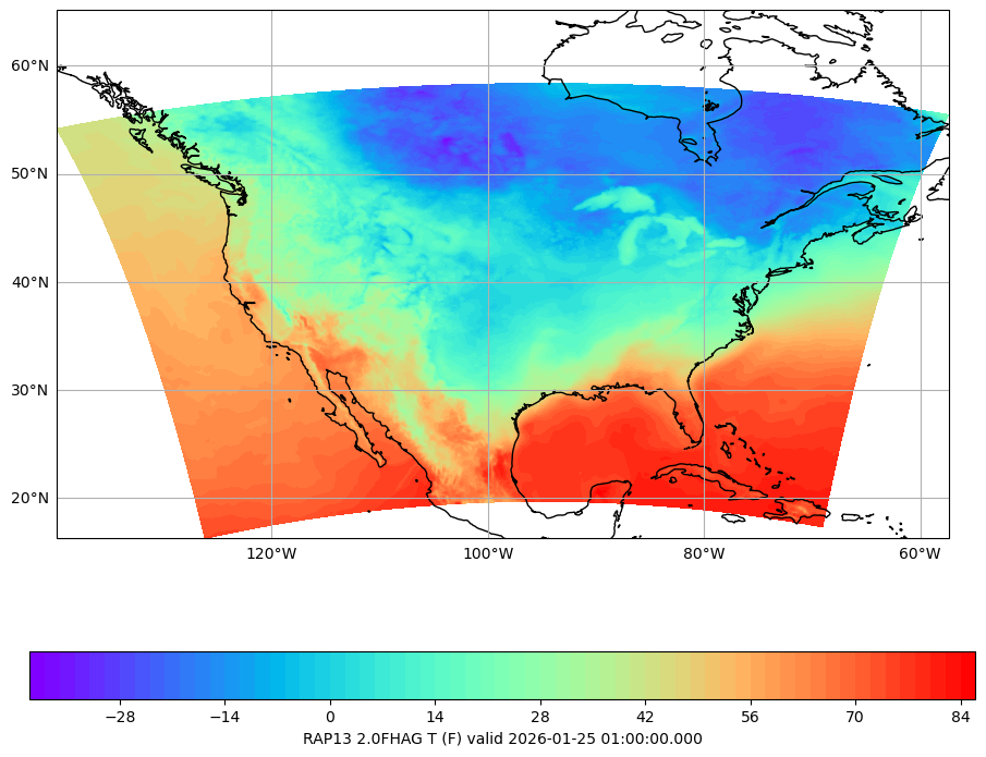
data = convert_temperature(data, 'K', destUnit)Plot Using pcolormesh
This example shows how to use matplotlib
cmap = plt.get_cmap('rainbow')
fig, ax = make_map(bbox=bbox)
cs = ax.pcolormesh(lons, lats, data, cmap=cmap)
cbar = fig.colorbar(cs, shrink=0.7, orientation='horizontal')
cbar.set_label(grid.getLocationName() +" "+ grid.getLevel() + " " \
               + grid.getParameter() + " (" + destUnit + ") " \
               + "valid " + str(grid.getDataTime().getRefTime()))
Plot Using contourf
This example shows how to use matplotlib
fig2, ax2 = make_map(bbox=bbox)
cs2 = ax2.contourf(lons, lats, data, 80, cmap=cmap,
                  vmin=data.min(), vmax=data.max())
cbar2 = fig2.colorbar(cs2, shrink=0.7, orientation='horizontal')
cbar2.set_label(grid.getLocationName() +" "+ grid.getLevel() + " " \
               + grid.getParameter() + " (" + destUnit + ") " \
               + "valid " + str(grid.getDataTime().getRefTime()))